Tuesday, August 29, 2017

Best Day Ever!


Those sweet summer days are winding down and we can already see the effects of days that are a bit shorter up north.  Our son had to work at 6 am the other day and he was not impressed when the sun wasn’t up at 5 am when he woke.  Next week school starts for our youngest and oldest (JH and last year of University).  The summer sun will soon give way to autumn.  But, today I thought I’d take one last grab at summer since we’re going to have a toasty week here again.  

This week’s Hues to Use from Power Poppy is a fun combination, and you could go a lot of different directions with it.  I’m choosing the summery sun and cool water route!


I started with Power Poppy’s set, Best Day Ever.  That beachy scene with a book always looks so inviting to me.  Stamped on Copic XPress It paper and coloured up with Copics to match this week’s Hues to Use.  I placed it on a sheet of watercolor paper that I smooshed some shades of blue onto, sprinkling with some course salt to get that mottled effect when it was wet.  I cut the top of the design with TCP’s Beaches CutUps Die.  


Some twine, some sequins and some Iridescent Nuvo Glitter Drops finish it off.  


Jump on in with us in the Hues to Use Challenge and you could win a guest spot on a future Hues to Use.  We put you in the spotlight and you get a fun new digital image to create with.  See the Power Poppy Blog today for more fun inspiration!  


Friday, August 25, 2017

Wheelie Great Birthday


Happy Friday people!  I’m popping in with a card I created for my brother’s birthday which is today. I thought that this awesome image from Power Poppy’s set, Move the Soul worked perfectly for a “young at heart” guy design.  

I pulled out some older designer paper from Authentique called Loyal initially because of the green and blue piece because it almost had the look of gears fitting together, and then I took my colouring cues from that.  

On the blue designer paper piece I added some tire tracks in Not Quite Navy SU ink to accent the background.  


I added some brads, which work here and were fun to use again since I so rarely do anymore.  You can also see that the motorcycle has varying shades of blue green and blue and I like that it gives you that iridescent metallic look.  


Here’s the inside of the design with more motorcycle tracks and the roughed up sentiment.  


Here’s the colours I used.  I know it looks like I used a ton of skin shades, that was just because the first ones I started with looked to peachy to me :), so I kept trying to dull them down a little.  

Here’s my girlfriends playing along today from the Power Poppy Sisterhood....


Christine Okken
Julie Koerber
Katie Sims
Tosha Leyendekker

and be sure you pop by the Power Poppy Blog for today’s Good Vibe 5!


Friday, August 18, 2017

Amaze Me


This past week we’ve had very special guests staying with us.  You’ve heard me mention over the years that when we did youth ministry we began going to serve with Churches in Mexico City every other summer.  That committment continues, and our high school students return next year to serve again.  Its been eleven years since the first time we took students, and this summer was the first time that some of our Mexican familia could come and visit us in Canada.  It was very special and meaningful for us.  There are some bonds that transcend culture and language, and we’re so grateful for them, their heart and warmth continues to amaze me.     

While they were here they asked if I was still making cards and I pulled out my “stuff” to show them what I do.  I stamped this pretty bee balm flower from Power Poppy’s Vibrant Thanks set to show them, and then pulled out my markers and did a quick colouring job.  It was so fun to show them something I love to do.  This image does colour up really fast and within 10 minutes it was complete....so it was easy to put it into a card for today.  They took a picture of me colouring below, so I thought I’d borrow it to show you me in action.  

Now onto more of the card details.....


I added a scalloped frame behind the image, paired it with some pretty minty papers done in scallops, added some pretty soft green ribbon and then a few gems that take on the green, blue and purple in the design.  


You have a a couple more weeks left to join in our Mix and Match Challenge where you could win a $50 Power Poppy Shopping Spree, and there’s another fun Hues to Use Colour Challenge you can enter too - you could be featured on the Power Poppy blog.  

Pop by my Bloomie sister Stacy for some more lovely inspiration today too!

Wednesday, August 16, 2017

Happy Bearthday!


Popping in with a little birthday design today.  I have this cute set from MFT called Beary Special Birthday.  It makes such cute designs with adorable party bears.  

I wanted to do a bit of different fold with this design so it’s made into a curved top gate-fold with the left side tucking into the balloons on the right as a closure.  All coloured up with Copics and then carefully trimmed out and popped up.  


The cute little banners are from The Cat’s Pajamas County Fair CutUps Die.  


I decorated the inside of the design a little to show off the cute presents.  Simple and sweet!  Here’s the Copics I used below.  


Thanks for stopping by!  


SaveSaveSave

Sunday, August 13, 2017

More Wedding Creations


Hello Again!  On Friday I showed you the frame I created for the couple who’s wedding I officiated this weekend.  Today I thought I’d show you the card I made to go along with the frame as well as a special card the Bride asked me to make to give to her Groom the day of the wedding.  


First up, this is the design I created to go with the gift.  I was running out of time with all the details of getting ready for the wedding, so I wanted to create something that wouldn’t take quite as long to put together.  This style of random stamping is easy to pull together, and the addition of layers of colour still gives you definition and depth.  All you need to is plot out how you want to stamp your elements and then use a MISTI tool, so you can stamp in the same place with each element in multiple layers of colour.  

To match the frame I used Power Poppy’s sets, Succulent Singles, and Peony Muse.  


For the sentiment I made use of the pretty fonts in Power Poppy’s set, Dream Wedding.  I embossed them on Navy cardstock and then tucked them into the framing of the design.  Like the frame, I added a few sequins to accent.  


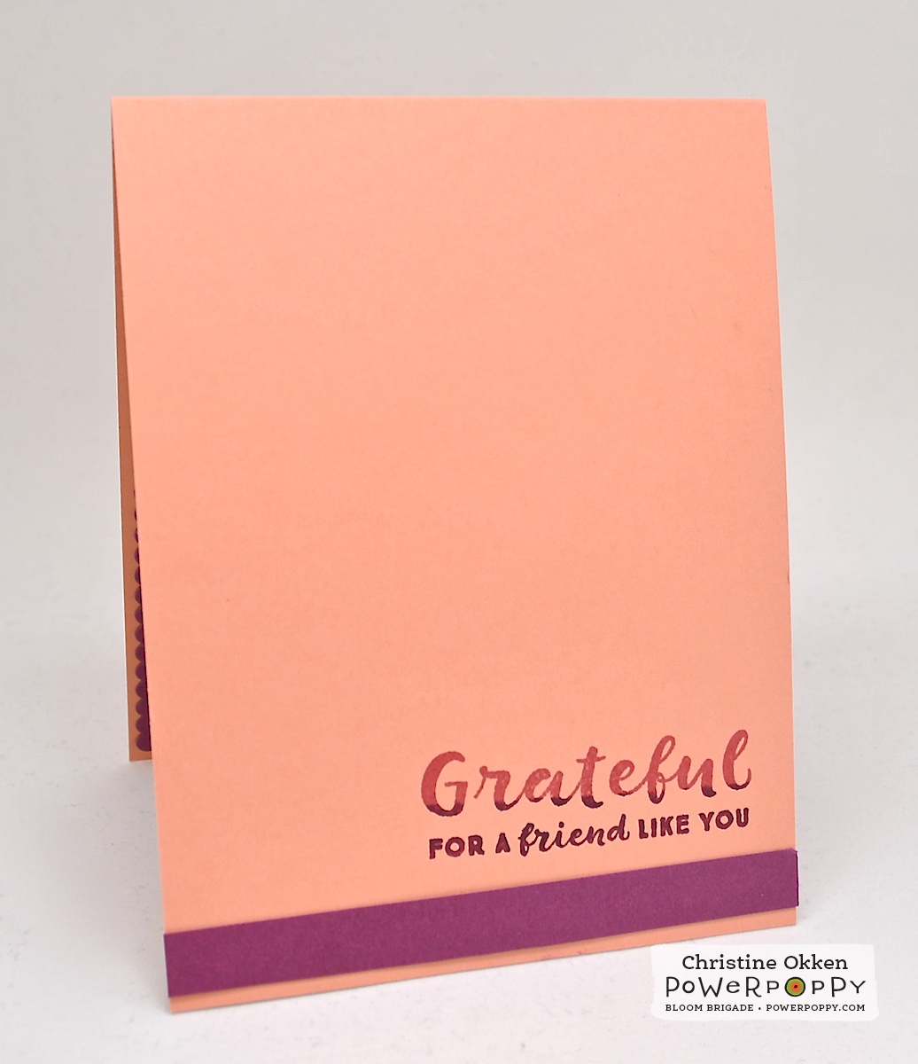
Here’s the inside of the card as well.  


Next up is the design I created for the Bride to give to her Groom.  One of the things she requested was for it to include the phrase Forever & Always.  


I was glad to have the lovely word CutUps die Always from The Cat’s Pajamas.  I cut it out three times and layered it together so that it would have some thickness to it.  I paired that with the succulents from Power Poppy’s Succulent Singles again, using some of the colours they’d have at the wedding, but adding more blues and greens to make it masculine.  The Succulent Singles dies work really well for this too as it eliminates a lot of fussy cutting of each piece.  

It’s all placed on a circular design cut with Spellbinders large dies.  The card is just over 5 1/2 wide.  


One of the elements she requested was for there to be some type of rope on the design.  One of the verses they chose was from Ecclesiates 4 which says “A cord of three strands is not quickly broken”. So the symbolism of how God ties them together comes in the twine that is tied into a sailor’s knot separating the patterned paper and the white top.  


For the inside of the design I needed to find a way to add the “forever” phrase.  I looked everywhere and didn’t find a “forever” in my stamps.  But as I was perusing, I found Power Poppy’s set, Vibrant Thanks and saw that it had a sentiment saying “For Everything”.  By just using the first four letters of everything I could make FOREVER.  I just used my navy pen and inked up part of the sentiment, moved part of the stamp closer, inked the “ever” part and made it all into one word.  It took a little bit, but it turned out beautifully.  

She loved it, and that’s what matters most.  Aren’t they a beautiful couple?  They are really special and it’s been so fun to see their journey together the past 3 years.  


It was a beautiful wedding, the day was full of sunshine, they were full of joy, and it was an honour to be a part of it.  


SaveSave

Friday, August 11, 2017

Succulents and Peonies for a Wedding


Tomorrow is a special day for me!  Most of you know that my husband and I are Pastors.  I work in the area of Pastoral Care at our Church.   In 14 years on staff we’ve done tons of weddings together, but on Saturday I will be performing my first wedding on my own!  I’ve come to know this lovely couple over the past few years and am blessed they asked me to do their wedding.  It will be outdoors, which is also a first for me.  I’m a bundle of nerves, and also quite delighted as well.  What a joy to watch two people covenant before God for a lifetime together.  

One of the things I sometimes like to do when we officiate weddings for people, is to create a gift for them based on the Scripture they chose.  So, this will be for them!  They chose 1 Corinthians 13:7 and Ecclesiastes 4:9 - 12.  Their wedding will be peach and navy with peonies and succulents as the flowers, which worked so perfectly with two of Power Poppy’s gorgeous sets!  


This was a bear to photograph because it’s just larger than 9 x 12.  So there are quite a few photos ahead.   I started with Power Poppy’s new dies for Peony Muse, and Succulent Singles and die cut out a lot of the different shapes of peonies, leaves, and succulents.  Then I stamped them all up with the stamps from Peony Muse and Succulent Singles.   They are coloured up with Copics, tying the colours together.   I printed the verses in some scripty text that was pretty and then added the flowers and succulents bit by bit until it framed the verses in a pretty way.  


I kept the accents to a few simple peach sequins so that verses would take center stage.  


Some of the elements are popped up a little and then other pieces are tucked behind.  


The above is with the frame open to get a bit of a clearer look at the flowers not under the glass.  I love that it’s such a personalized, meaningful, yet simple gift for them. 


And....as you can see I’ve combined two different Power Poppy sets together, which is perfect for Power Poppy’s newest Power & Spark Challenge to Mix and Match!  

Next week I’ll show you the card I made for the design, and a special something the bride asked me to make for her groom.  


Who would have thought you could put peonies and succulents together?  But I really think it works. So this challenge is your opportunity to put different images together and find great new ways to show off your creativity.  We hope you can join us, it could mean a $50 shopping spree in the Power Poppy Store!  

Here are the Bloomies playing along with more inspiration today....


Christine Okken (you are here)
Katie Sims
Stacy Morgan

and Julie giving us the Good Vibe Friday at the Power Poppy Blog!


Save

Tuesday, August 8, 2017

Fresh Berries


How are you this lovely Tuesday morning?  In the mood for something fruity?  I have a gorgeous new image from Power Poppy called Cherries and Berries to show off.  It’s a great new digital set that has raspberries like I’m showing above, PLUS cherries and strawberry together in one great set.  And, it includes some sweet sentiments too!  Marcy’s fruit illustrations are some of my favourites, And, I happen to love raspberries.  

For this design I enlarged the image quite a bit so that it would take up most of a card base, then I gave it some pretty colour to go with this week’s Hues to Use Challenge that started today.  


Just look at these pretty colours together!  Aren’t they gorgeous?  


Here’s a closer peek at the colouring, you can see I added some pretty peach around the image to warm it up.  I stamped the sentiment first in Momento Rhubarb Tart ink, and then came back and swiped some more of the stamp in a raspberry ink to give it a two toned look.  It all works so easily with a MISTI tool.  The sentiment is from Power Poppy’s set, My English Rose.  


Here’s the inside of the design where I also double stamped the sentiment.  This one is from Power Poppy’s set, Nice Things to Say.  


Here’s the Copics for this one.  


Check out our “brand-new" 14 year old!  The baby is all grown up, and we’re so blessed by his love for life and genuine love for others. He is such a fun kid.  I only have a few months more and I will be the shortest in the family....he’s going to tower over me soon!  


Enjoy your day friends!    Thanks for stopping by!  

Please jump in with us in the Hues to Use Challenge this week.  You could win a guest spot in a future Hues to Use Challenge.  Pop by and visit the Power Poppy blog to see who’s featured today!


SaveSaveSaveSaveSaveSave
Save

Friday, August 4, 2017

Mix and Match Challenge


We’ve got a brand spankin’ new challenge at Power Poppy this month, and our hostess is the lovely Tosha.  It’s a fun one called Mix and Match, where you’re invited to combine Power Poppy stamp sets.  You can mix digital sets together, clear sets, or get really crazy and combine digital sets with clear sets.  Its a fun way to stretch your creativity further, and also see how you can stretch your stamps by using them in different ways.  


I chose a really simple way to mix and match since I already had one of the pretty cloches culoured up from our new set called Under Glass.  It has a pretty luna moth, button card and a cute stack of books.  When I was colouring it I knew I wanted that luna moth to be a bright green, and then when I got to the books I decided to really go a bold direction and make one of the books deep red.  

So, for the Mix and Match element I used the butterflies from Power Poppy’s set Pure Prairie Spirit to stamp in the background.  Even though they’re not moths, they’re still fluttery so I thought they would work, as well as the sentiment from Pure Prairie Spirit.  

I used an embossing folder to mimic the pattern on the green book, and the red horizontal stripe of card stock matches the red book.  So, its a little bright and not quite what I usually do with the unusual mix of colours, but all in all I think it’s a cheery card.  


A couple of enamel dots finish it off and below are the collection of Copics I used.  Another card where I coloured when I was visiting my mom and dad.  


Don’t forget that if you play along and win it means a $50 Gift Certificate to the Power Poppy store!  

Here’s the Bloom Brigade bringing you inspiration today!

Christine Okken
Cindy Lawrence

Stacy Morgan
Tosha Leyendekker